Color Palettes
Red Hat Design System comes with a contextual color-theming feature called "Color palettes", designed to make page developers' and content authors' jobs easier and to improve customers' digital experiences. Authors and developers who adopt the color palette system will produce accessible, branded experiences with less effort and greater cross-property consistency.
What are color palettes
There are various color palettes within our design system. The palettes you will use the most for the majority of your projects are the lightest and darkest themes.

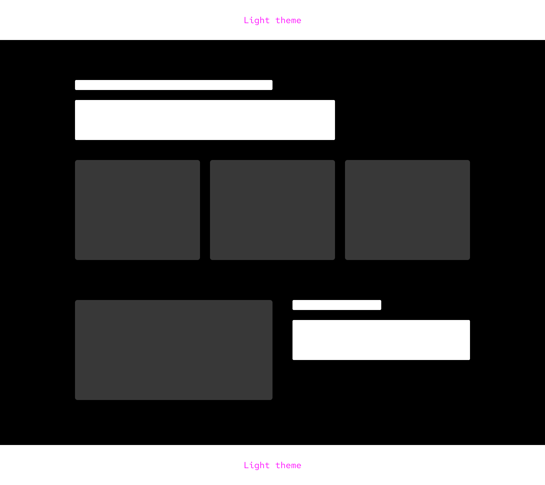
Example
Create, manage, and dynamically scale automation across your entire enterprise.
More cloud choice. Less cloud management.
HTML
CSS
How color palettes work
RHDS' color palette system is an HTML and CSS system with some supporting JavaScript[1]. The color palette system has two main parts: providers and consumers. Providers actively define a color palette, while consumers passively accept their theme from the nearest provider ancestor.
Color palettes allow for the creation of different experiences using the same design system. When a color palette is changed, elements change including color, space, text, and more. Layouts, content, and imagery usually stay the same.
Choosing a color palette
How you choose a color palette is based on content, user experience, and accessibility needs.
Lightest color palette
The lightest color palette is the default and has lots of use cases.
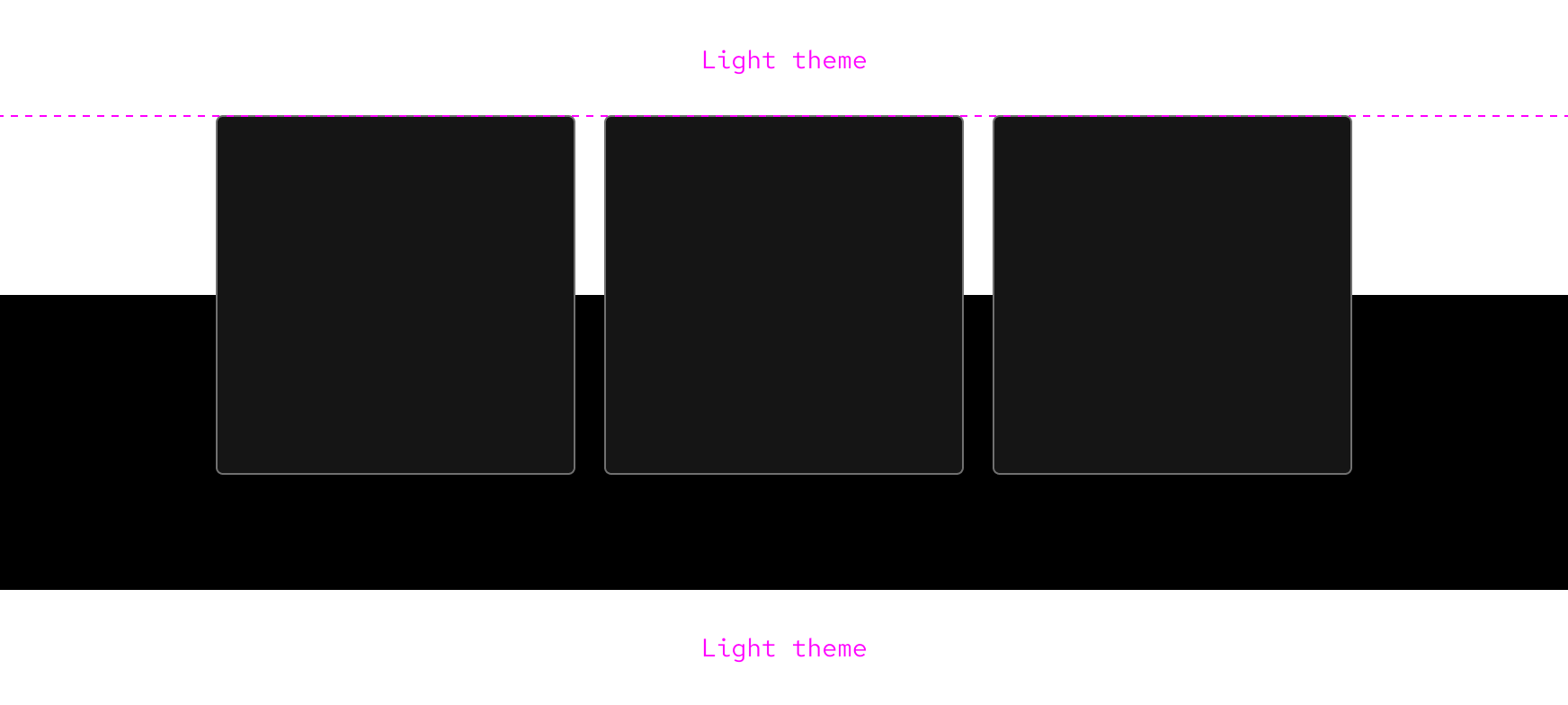
Darkest color palette
The darkest color palette can be used for highlighting content with dark colors or if a brighter interface would otherwise disrupt the user experience. Most light elements and patterns have dark counterparts.
Brand red and accessibility
Do not apply the Red Hat red color to text in dark environments unless it meets WCAG 2.1 AA requirements.
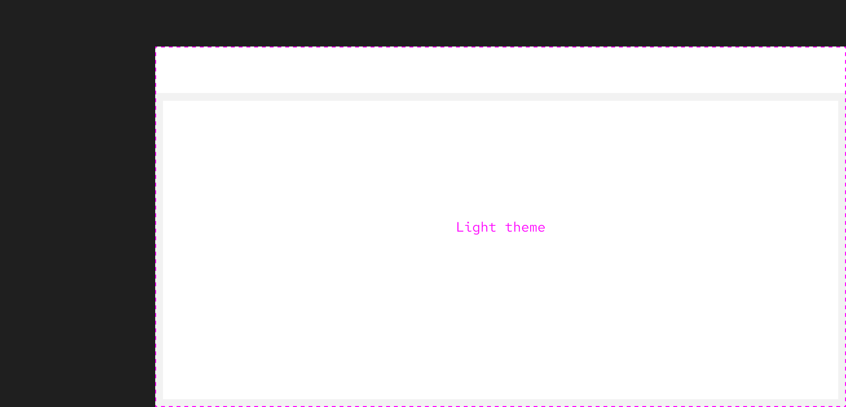
Inline color palettes
Inlining a color palette is when a section switches palette and looks different than the rest of the page or interface. Some use cases include highlighting an important section on a page or adding a sidebar to an interface. Use inline theming only for major shifts in color. For minor shifts, use a different surface color from the same theme.
Update from the team
The design system team is working on creating inline theming best practices in the near future. Contact us if you would like to contribute.
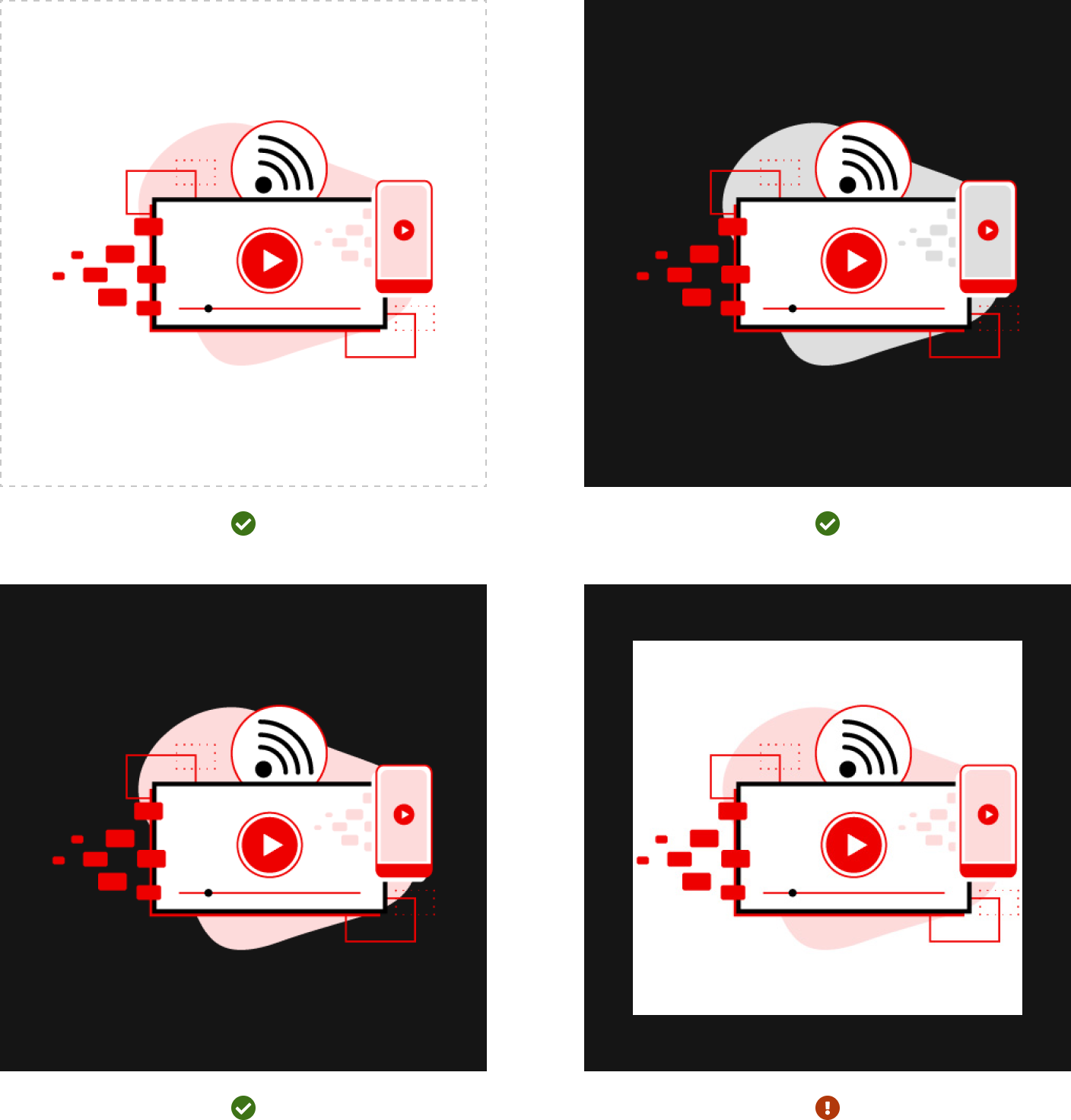
Illustrations and imagery
Illustrations and imagery should align to the theme. The light theme should feature imagery with light colors and vice versa. Imagery with high contrast is only acceptable if it has a transparent background. If you cannot find theme-specific imagery, contact the Brand team.
More information
High contrast is using bright elements, patterns, or images in dark environments and vice versa. This is useful to focus attention or create visual tension.
Color theme consumers and theme tokens
Color palette providers
Providers define the color palette for themselves and their child elements. There are six main color palettes:
Lightest Lighter Light Dark Darker Darkest
Context providers typically use the lightest color palette as the default.
Authors may define the color palette of a container using the color-palette HTML
attribute. So for example, to create a card with the darkest color palette, use
this HTML:
Example
This card uses the default color palette.
This card uses the author-set "darkest" color palette.
HTML
Color theme consumers
Consumers, which adopt a color theme. Color themes correspond to the
active color palette, and represent the quality of the background colour:
- light
- dark
Child elements which are providers will automatically adapt, applying their own color theme as needed. Page authors do not need to and should not customize colors of consumer elements.
Color palette containers can be nested, such that child elements will always adopt the color theme corresponding to the nearest container's palette.
Extending our card example from above, if our page author then adds an
<rh-cta> to the card, it will automatically adopt the dark color theme. The
page author need not and should not customize the CTA.
Example
The card and CTA respond to the theme of their container. On a light container, the CTA uses the light theme, and dark on dark.
The card uses the "darkest" palette. The CTA is always themed with the "dark" theme, because the card sets its own palette, rather than responding to it's container's.
HTML
To summarize: color providers can have one of up to six palettes, three dark and
three light, and they provide a dark or light theme to their children.
Combination elements
Some elements are both providers and consumers. Card, for example is both a provider and a consumer. It can accept the color theme of its parent context and it can also set its own color palette.
Example
Consumer
This card acts as a consumer.
It will always receive its parent's ColorTheme.
Provider
This card acts as a provider.
Try changing this card's
color-palette
and see how it affects this card's children.
HTML
Other libraries
To learn more about our other libraries, visit this page.
Feedback
To give feedback about anything on this page, contact us.
Other libraries
To learn more about our other libraries, visit the getting started page.
